

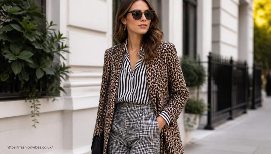
Mixing prints and patterns works when you anchor the combination with a shared colour or scale, rather than matching patterns exactly. Done well, mixing prints and patterns reads as confident and considered. Done without a system, it reads as chaotic, and the difference usually comes down to a few simple rules rather than natural instinct.
Mixing Prints and Patterns: Why It Usually Goes Wrong
The most common mistake is combining patterns with nothing in common, different colour families, wildly different scales, no shared thread for the eye to follow. Basic colour scheme theory explains why, complementary or analogous colours create visual harmony, while unrelated colours create visual tension even before pattern is factored in. A floral in pastel pink paired with a geometric print in bright orange has no anchor point, so the outfit reads as two unrelated decisions rather than one considered look. Successful pattern mixing almost always shares something: a colour that appears in both prints, a similar scale, or a unifying neutral that ties the look together.
Mixing Prints and Patterns: The Core Rules
- Share a colour. Pick two patterns that include at least one matching colour, this is the single easiest way to make a combination feel intentional.
- Vary the scale. Pair a large-scale print with a smaller, subtler one. Two bold, large patterns together tend to compete rather than complement.
- Use a neutral as a buffer. A plain jacket, bag or shoe between two patterned pieces gives the eye somewhere to rest.
- Stick to two patterns, not three. A third pattern is where most outfits tip from considered into overwhelming, at least while you’re building confidence with the technique.
Easy Pattern Combinations to Start With
| Pairing | Why it works |
|---|---|
| Stripes + florals | Stripes read as a near-neutral, so almost any floral sits comfortably alongside them |
| Small polka dot + large check | Strong scale contrast keeps both patterns legible rather than competing |
| Animal print + solid colour pulled from it | Treats animal print as a neutral, then ties it back with one matching solid piece |
| Gingham + floral in the same colour family | Shared colour does the anchoring work even though the patterns themselves differ |
Building Confidence Gradually
If pattern mixing feels unfamiliar, start small rather than attempting a full head-to-toe combination. A patterned scarf against a striped top, or patterned shoes against a printed bag, are low-risk ways to practise the colour-sharing principle before committing to two patterned clothing pieces at once. Once the colour-matching logic feels automatic, scaling up to bolder combinations gets considerably easier.
This pairs naturally with a smaller, more coordinated wardrobe, since a limited capsule wardrobe palette makes it much easier to find pieces that already share a colour. If most of your wardrobe sits within two or three core tones, nearly any patterned piece you add will have something to pair against. Our capsule wardrobe for women guide covers how that kind of coordinated base gets built.
Pattern Mixing vs Tonal Dressing
These two techniques sit at opposite ends of the same idea. Tonal dressing creates interest through shade variation within one colour family; pattern mixing creates interest through print variation anchored by a shared colour. Both rely on the same underlying principle, give the eye one consistent thread to follow, whether that thread is colour, pattern or texture.
Common Pattern Mixing Mistakes
- No shared colour at all. Two patterns with completely different palettes rarely work together, however much they’re liked individually.
- Two bold prints at the same scale. Without a size contrast, patterns compete for attention rather than complementing each other.
- Forgetting accessories count as patterns too. A printed bag or shoe still needs to follow the same colour-sharing logic as clothing.
- Overcorrecting with too many neutrals. One neutral buffer piece is usually enough; several can mute the patterns rather than balancing them.
Mixing Prints and Patterns by Body Shape and Proportion
Where you place each pattern matters as much as which patterns you choose. Keeping the busier, bolder print on top and a calmer, smaller-scale print on the bottom tends to balance proportions well for most body shapes, since it draws the eye upward first. The reverse, a bold printed trouser or skirt with a plainer top, works just as well and can elongate the leg line, particularly with a vertical-leaning print. When mixing prints and patterns across a full outfit, a defined waist, through a belt or a fitted silhouette, helps separate the two prints visually so they read as a considered pairing rather than one busy block.
Mixing Prints and Patterns for Different Occasions
- Office or smart casual. Keep pattern mixing subtle, a fine pinstripe shirt under a small-scale check blazer reads as considered rather than loud.
- Weekend and casual. This is where bolder mixing prints and patterns experiments work best, since the stakes and formality are lower.
- Evening and occasion wear. Richer, more saturated colour pairings tend to photograph and read better under evening lighting than pastel combinations.
Building a Pattern Wardrobe Without Buying Much
You don’t need a closet full of prints to start mixing prints and patterns. Two or three versatile patterned pieces, a striped top, a small-scale floral or polka dot blouse, and a check or animal print accessory, give you enough raw material to build a dozen different combinations. Look first at what you already own, since most wardrobes contain at least a couple of patterned pieces that have never been deliberately paired. Lay them out on the bed, group them by shared colour, and you’ll often find a workable combination without buying anything new.
When you do shop, prefer prints in a colour family already present in your wardrobe. A new patterned shirt in navy and cream will pair easily with existing navy trousers, whereas a bright, unfamiliar palette will need its own supporting pieces. This is the same logic behind a small, coordinated wardrobe: fewer colours mean more combinations, and mixing prints and patterns becomes far easier when your base palette stays consistent.
Frequently Asked Questions
Can beginners mix patterns, or does it take practice?
Beginners can start successfully by following the shared-colour rule alone, it removes most of the guesswork and almost always produces a combination that reads as intentional.
Is it ever acceptable to mix three or more patterns?
Yes, but it’s a more advanced technique that benefits from a tightly shared colour palette across all three prints, and from varying scale significantly between each one.
Do stripes count as a pattern when mixing?
Technically yes, but stripes behave more like a neutral in practice, since they’re simple enough to pair easily with almost any other print.




Leave a Reply